Connect With Us
Visit Us
250 West Nyack Road, Suite #200 West Nyack, NY 10994
Get Directions
Call Us Toll Free
877-GO-RUSTY
877-467-8789
Telephone
845-369-6869
Fax
845-228-8177
Departments
Departments
Departments
SUBSCRIBE TO NEWSCONTACT US
Last Updated: 08/08/2004
The fundamentals of search engine friendly design apply to all types of sites, including e-commerce catalog sites. The beauty of the dynamic e-commerce catalog is that generating search engine friendly e-commerce catalogs is easy. This document will give you a walk through of a typical e-commerce store, from its homepage to its catalog pages and from a product page to a brands landing page, explaining how to optimize each page to leverage organic search engine traffic.
The format is similar to navigating through a typical e-commerce Web site. We will start with the homepage, travel to the category pages, then move on to the sub-category pages and then down to the product page. We will also touch on the brand pages and the site map.
Search Engine Friendly E-Commerce Web Sites
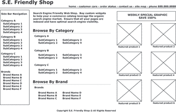
The typical e-commerce homepage has the company logo, some company specific information at the top, side bar navigation at the left, more prominent navigation in the middle of the page and featured products and sales on the right side of the page. I created a typical screenshot of the various pages to provide clarity throughout this document. The homepage will typically look like this image. Lets pick apart each section of the homepage from a search engine optimization standpoint.
Header
The header, which is typically an include file on each page, contains the company logo and top bar navigation. The logo should be a link to your homepage, and contain an alt tag and possibly a title attribute in the link tag. The remaining top navigation can be in nicely formatted text links. There is no real reason to make these top navigational links graphic buttons like many e-commerce sites currently do. Instead, use simple text links and format them with cascading style sheets to make them look nice. Another tip is to dynamically change the alternative text tag for the company logo for each page to represent the same text you have on the title of the page. This way, when you conduct an allinurl:www.domain.com site:www.domain.com lookup in Google, it will display all the pages of the site and not give you that annoying message that they omitted results because they looked to be duplicate. Google currently does not use alt text within their ranking formula, so there is no current benefit to change the alt text for ranking purposes. For usability and credibility reasons, you always want to include the store's phone number in a location that is clearly visible on each page. Thus many sites include this information in the header file.
![]()
Left Side Navigation
 The beauty of the left hand side navigation is its ability to solve two common e-commerce issues. The first solution is usability, having a well defined left hand side navigation bar will provide a level of clarity to your Web site. Web site visitors will know how to easily navigate throughout your site as long as you keep the navigation consistent throughout each and every page. The second solution is search engine visibility, having a mini site map on the left side of each page makes it easy for search engines to crawl and then index your Web pages.
Since this document is mostly about the search engine friendliness of your e-commerce shop, lets discuss the second point in more detail.
Crawlers, by nature, need a method of locating your pages. Many sites that exist today make it hard for crawlers to locate these pages on your site. For example, lets say that your left hand side navigation is designed in Flash. Most search engines have a hard time finding the links within Flash files, so the search engines will not be able to locate the pages behind the Flash files. Problematic navigation elements can be found in my article named Internal Linking Structure Elements Strategy.
A text based side bar will work wonders in having the crawlers navigate throughout your site. In addition, it will provide an easier shopping experience for your customers.
Homepage Content Area
For most new e-commerce sites, having content on the homepage will have an impact on your search engine rankings. After all, it is the content that the search engines look for when determining what your page is all about. Of course, links to your site play a huge role; but in our case, we are talking about a search engine friendly e-commerce site and not the "off-page factors". For search engine friendly design, content is a very important factor. As you can see on the homepage, I have added an area for content on the page. The content should read well and contain your targeted keywords. Keep in mind that when your homepage ranks for a specific keyword, Google will normally use the content on the page for your description in the results page. Keep this content clean, easy to read and catchy.
The content I used for my Search Engine Friendly Web Shop's homepage reads as follows:
Search Engine Friendly Web Shop. Buy custom widgets to help your e-commerce catalog leverage the organic search engine market. Ensure that all your pages are indexed and have optimal search engine visibility.Now, tell me, wouldn't that copy encourage you to click on my e-commerce site?

Remainder of the Homepage
You can see that I have replicated the left hand navigation in the middle of the page, but oriented the listings differently. I am not a usability expert, but I tend to like sites that repeat the site navigation on the homepage in this fashion.
On the right hand side of the page, I have placed weekly specials and featured products. It is smart to put new items in this area because most sites have their index pages indexed more often then their internal pages. Any new page you add that has a link off the index page will get indexed sooner then if they were found deeper into a page. In addition to the search engine benefits, placing the products and specials on the right portion of the side will help increase the visibility of those products by your customers. Many eye-tracking show that people normally look towards the right portion of the page, especially if there are images.
At the bottom of the homepage and on every page throughout the site is the site's footer. A "footer" is an important final touch to the site. I recommend that the company name in the footer link back to the homepage.

That covers the basics for building a search engine friendly e-commerce homepage. To recap, the header, left hand side navigation and middle area components of the homepage are all important for building a e-commerce site which has a good internal linking structure. Remember the search engines have to click on links in order to find your pages. The right hand side products and specials are there to increase those products visibility for search engines and your customer. For more information on dynamic URLs and the problematic areas they pose, visit my article named Dynamic URLs in the Eyes of a Search Engine.
The Category or Sub Category Pages
Category and sub category landing pages are not only a must have for usability purposes but a necessity for search engine visibility. The category pages are a way to break down your product offerings into a logical and meaningful classification. By classifying or grouping your products into categories, you will be able to help your user better locate the product they are looking for and help the searcher land directly on the page he or she is searching for.
For example, let's take a Web site that sells computer products and services. The company can break down their products into four main categories. The main categories can be hardware, software, consultation and warranties. Your goal, as an SEO, is to target the keyword phrases "computer hardware", "computer software", "computer consultation", and "computer warranties" respectively. Within these four main categories, you will most probably want to break down into several deeper sub categories. For example, the hardware category can contain the following sub categories; desktops, laptops, monitors, printers, scanners and so on. The software category can be broken down into the following sub categories; education, business, financial, technical, entertainment, and so on. By now you can see why category and sub category pages are a necessity for both the customers and search engines.
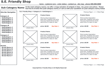
TITLE & META TAGS: The diagram below shows the important elements in constructing search engine friendly category and sub category pages. Let's begin from the top of the page and go down. The title of the page should contain the category name, if you are on the category page or the sub category name, if you are on the sub category page. So if we are on the desktop page within the hardware section, you probably want to target the keyword phrase "computer desktops" for the title of that page. The meta tags can contain this information as well. For the meta description I like to use the following syntax; "Find [sub category name] at [store name]". And for the meta keywords I like to use the following syntax for the category pages; "[category name plural, category name singular, category name misspelling1, category name misspelling2, category name misspellingN]".
LOGO: The S.E. Friendly Shop logo can either be text based or a graphic. Most of the time this logo will be a graphic. When it's a graphic, I like to dynamically insert the alternative text to read [category name from store name]. The reason I do this is because when I check to see if the pages are indexed in the search engines, the search engines normally pull the top most content. If the top most content is the logo, and if the logo has the same alternative text on every page, the results will normally be filtered. Let me stress that this is just a 'pet peeve' of mine, and I do not think it has an affect on rankings.
HEADER TAG and TOP of PAGE: It is always recommended to have the category or sub category name repeated in the header tag (<h1>) towards the top of the page. Then have a hand written page description with keywords for that page in the description. This description should be written for your shopper but there is no reason not to include keyword phrases that the search engines want to see. Also towards the top of the page, you should place a "breadcrumb trail". A bread crumb trail is a little text based line that shows you the click path you took to get the your current page. So if I clicked from the home page to the computer hardware page and then to the computer desktop page, the breadcrumb would read "home -> computer hardware -> computer desktop". You should make breadcrumb text links to the appropriate pages. So the "computer hardware" part of the breadcrumb trail will link back to that page. Not only is this a great usability feature, but search engines love it also.
SIDE NAVIGATION: Repeated throughout the site and always in the same location on the all the pages, your user should be able to find the site navigation. Consistent navigation will make for happier Web visitors and happier Web visitors are more likely to buy. Many e-commerce stores remove the side navigation from the checkout pages, in order not to distract the customer from the buying process. This side bar navigation should be HTML. It will act as a mini site map on every page. Search engines love it and so do your Web visitors.
PRODUCT DISPLAY/SUB CATEGORY DISPLAY: In the middle portion of the page you should list out the products within that category or sub category, and also have a breakdown of more filter options. So when you are in the category page, it is a good idea to have text links in that middle portion to the sub category pages. It is also important to have product on those pages, for those consumers who are not sure what they want. The product information should contain simple text based links to the product detail page. The link should contain the product name, a short product description underneath, and then an eye catching "buy now" or "more info" button. The product image should be clear, attractive and large enough to entice a user's action. The product image should contain alternative text with the product name and link to the product detail page. Filters for the category or sub category pages can work to your benefit. Filtering by brand, price, size, or any other product attribute will give you a better shot at ranking well for more keyword phrases. For example, if you had a filter on laptops based on monitor size then you can rank well for keywords such as "15 inch laptop computers."
The Brand Landing Pages
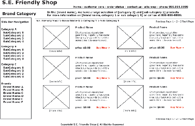
The brand landing pages work much like the category landing pages. They provide an extra level of product navigation that is useful for your consumer and great for your keyword rankings. With a brand landing page you can target keyword phrases that are searched for daily. For example, I am looking for Apple products, and I might search on "apple computers". Your goal is to rank somewhere under the official apple computers site. But you can target phrases even deeper then that, such as apple hardware or apple laptops and or apple 15" laptops. The on page construction works exactly the same way as the category or sub category pages but you should substitute the proper keywords in the relevant places. I have provided a mock up of a brand page that is targeting a specific sub category of a brand below.
The Product Page
Product pages are the easiest pages to rank well because they target the most specific keywords. It is thus important to properly name the product by keeping your Web visitors and the search engines in mind. Your product pages are constructed similarly to the category or brand pages but they are focused around the keyword phrases that match that specific product. Let's start from the top of the product page and discuss what elements are important to include.
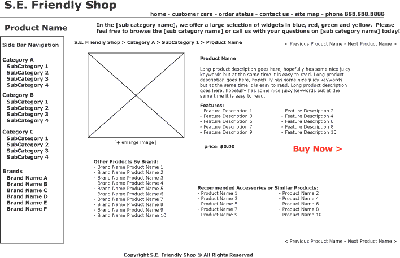
TITLE & META INFORMATION: The title of the product page should match the product name. The meta description should be formatted in a way that entices the searcher to click from the search results page to your product page. The meta description can be written in the following fashion; "Save $XX.XX on [product name] if you order [product name] with [store name] today!" Of course, fashion this product description based on what is most meaningful and attractive to your target audience. Your meta description can match or be similar to the content at the very top of the page (in the screen image, this content begins with "In the [sub...]"). The meta keywords should contain the product name, product misspellings, product synonyms and other keywords that you might think would attract people to this page.
HEADER TAG and TOP of PAGE: The header tag (h1) should contain the product name. The top of the page should also include a short description of the product, possibly the one used on the category pages or used in the meta description. One should also add on to the breadcrumb trail, the product name at the tail end of the breadcrumb. So in our example above; "home -> computer hardware -> computer desktop", we would add on "product name". The breadcrumb will now be in the format of "home -> computer hardware -> computer desktop -> product name".
The side navigation remains constant on the left of the page, as discussed above.
MIDDLE OF PAGE: In the middle of the page is the detail of the product. A nice thing to have is large image that if clicked on brings up an even larger image in a small window. The image should contain an alternative text tag with the product name. The product name should be listed on the page as well in a header font or bold tag. The long description should follow and if possible include features or specification or details that are useful to the consumer. At the top and bottom right corners of the page, I like to include links to the previous and next products in the category selected. In addition, under the fold, I like to include additional links to products within the same brand and products that are similar to this product. These links are no only helpful to the Web visitor but it makes it easier for search engines to find your pages. Anchor text link popularity is improved slightly.
How to Use this Document:
That covers the search engine friendly e-commerce site guide. This document is meant to be brief and easy to understand. Many of the deeply technical areas of how to build such a site are left out. URL rewriting, dynamic page generation, cascading style sheet usage and database development are omitted. You can take this document and give it to your Web developer and ask them to implement these guidelines. Then you are on your way to a search engine friendly e-commerce store. Of course, make sure to review the document and make specific suggestions based on your product and target audience. If you need custom e-commerce solutions you can contact my company, RustyBrick, at 866-GO-RUSTY or via the Web at http://www.rustybrick.com/.
RustyBrick SEO Articles
For more information on our search engine optimization and search engine placement services, please contact us at 877-GO-RUSTY or 845-369-6869 or via email at our contact page.
250 West Nyack Road, Suite #200 West Nyack, NY 10994
Get Directions
877-GO-RUSTY
877-467-8789
845-369-6869
845-228-8177
1 COMMENT